Latest Blog Posts


Oct 24
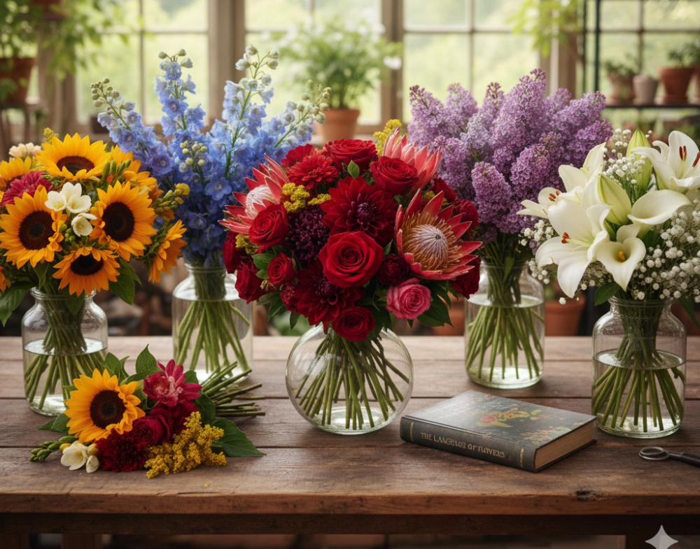
Color as a language: the psychology of shades in bouquets
Flowers speak without words. They express feelings, moods, even intentions. But to "hear" this language, it's important to understand the meanings conveyed by different shades. For clients, color often becomes a decisive factor in their choice: one bouquet will seem delicate and romantic, another bold and daring, a third formal and formal.
For a florist, understanding color psychology is more than just aesthetics. It's a tool that helps create not just "universal bouquets," but compositions that truly work as personalized messages.
Why does color matter?
Color affects a person on several levels: emotional, cultural, and even physiological.
- Emotions. Scientists have proven that color directly influences mood. Red hues accelerate the heartbeat, blue and green are calming, and yellow and orange energize.
- Symbolism. In different cultures, the same color can mean opposite things. In Europe, white symbolizes purity and weddings, while in some Asian countries, it symbolizes mourning.
- Marketing. Color shapes perceptions of price. A bouquet in pastel shades seems more elegant and expensive than a similar bouquet arranged in bright contrasts.
- Individuality. Each person has their own associations. For some, yellow flowers symbolize betrayal, while for others, they symbolize sunshine and happiness. The florist's job is to take these personal stories into account.
The psychology of primary colors in floristry
- Red. Strength, passion, energy. Often chosen for declarations of love and romantic gestures. At the same time, red in corporate bouquets can symbolize leadership and confidence.
- Pink. Tenderness and care. Light shades evoke romance and awe, while richer shades convey style and femininity.
- White. Sincerity, purity, a new beginning. A classic for wedding bouquets, but also a good choice for formal celebrations.
- Yellow. Joy, energy, openness. Increasingly perceived as a symbol of friendship and support.
- Orange. Optimism and drive. Suitable for motivational gifts or corporate events.
- Green. Harmony, freshness, balance. In a bouquet, greenery not only serves as a background but also as an important psychological accent.
- Blue. Confidence, tranquility, and premium quality. Suitable for formal and unusual arrangements.
- Purple. Creativity, mystery, spirituality. This is the choice for those who want to stand out and emphasize their individuality.
How combinations create new meanings
A bouquet is rarely built on a single color. It's the combination of shades that creates depth and a special resonance.
- Red + white. A contrast of passion and purity. Symbolizing emotional balance and harmony, it is often used in wedding floristry.
- Yellow + pink. Joy and tenderness. An excellent choice for friendly greetings and lighter occasions.
- Purple + green. Creativity and stability. This combination is chosen by interior designers and art clients.
- Monochrome. One color in different shades creates a sophisticated and stylish look. For example, a bouquet of pink peonies, ranging from soft pink to deep crimson, looks rich and harmonious.
For a florist, the ability to work with palettes is not only about aesthetics, but also about the ability to "read" the client and offer them exactly the emotion they want to convey.
Practical application for a florist
- Client consultation. Providing hints about the meaning of flowers not only helps facilitate the selection process but also enhances the bouquet's value in the client's eyes.
- Subscriptions and regular deliveries. You can build a concept around a "color of the week" or seasonal palettes, creating a sense of anticipation and surprise.
- Corporate orders. It's important to consider the company's signature colors—this enhances the effect and makes the gift "branded."
- Wedding and event arrangements. The bouquet's color should fit into the overall palette of the event, enhancing the atmosphere.
- Interior design. A bouquet for an office or restaurant can serve as part of the design and influence the mood of guests.
Mistakes when working with color
Even professionals make mistakes sometimes.
- Ignoring cultural context. A white bouquet will be perceived differently in Russia and China.
- Excessive brightness. When a composition has too many loud colors, it looks cheap and overloaded.
- Misunderstanding the client. If a client says they don't like red, no amount of symbolic explanation will convince them.
- Following fashion without considering psychology. Trendy palettes are good, but only if they suit the occasion and the person.
Trends in flower arranging
- Natural palettes. Shades reminiscent of nature are increasingly being chosen: earthy, herbal, and pastel.
- Bold duets. Red with purple, yellow with blue—combinations once considered "bad" are becoming fashionable.
- Gradients. Smooth transitions within a single bouquet add depth and create a "painterly effect."
- Artistic palettes. Florists are increasingly inspired by artists—from the Impressionists to contemporary art projects.
Conclusion
Color is the language a florist uses to communicate with clients and bouquet recipients. By understanding the psychology of color, one can create arrangements that not only delight the eye, but also evoke emotions, convey messages, and even influence behavior.
A bouquet designed with color psychology in mind is always perceived as more meaningful and valuable. This is a competitive advantage that helps a florist stand out from the crowd and develop their own signature style.
Your experience matters! Take a short survey and see what answers other flower business representatives gave. Take part